


Audible Brand System
With more original audiobooks growing every day, Audible knew it was time to make a bigger and more consistent mark in the world. The brand was getting lost behind busy book covers, and as Audible stepped further into the marketing world, they were creating singular one-off campaigns with little brand equity.
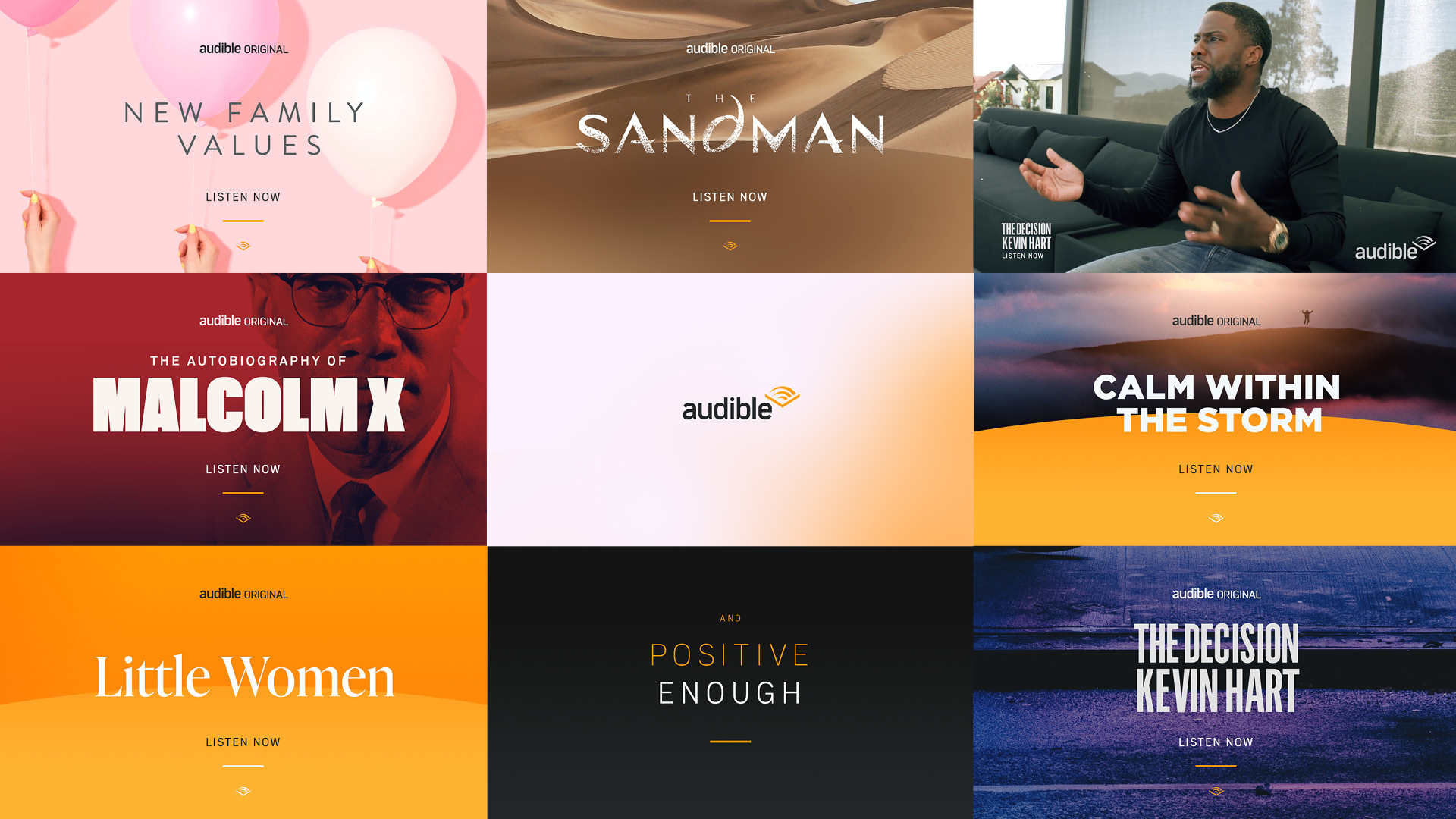
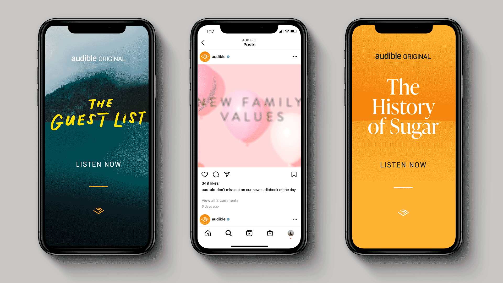
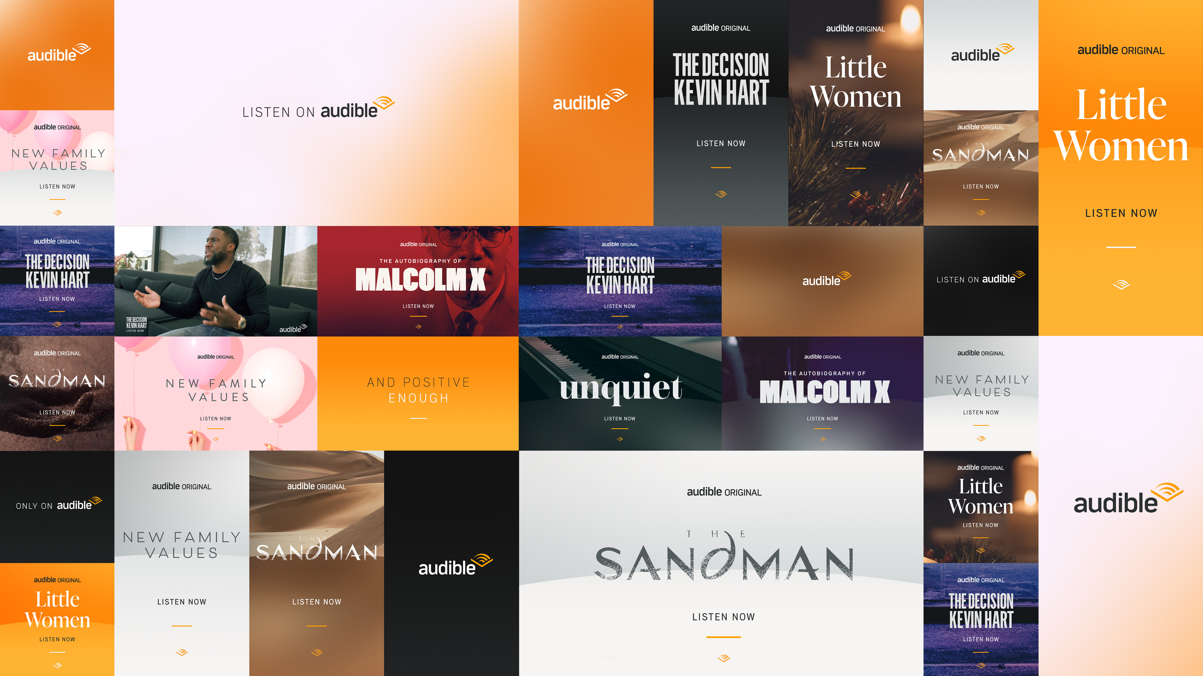
The main strategy of this design was to REVEAL a world of new stories to listeners and create a system that brought the Audible Brand to the forefront of all content. There would be no question it was an Audible book, promo, post or marketing campaign from here on out.

The next and biggest task at hand was to re-design the hero infobar and all corresponding LIVE graphics that deliver the networks must current and breaking news and information. The new infobar was carefully crafted and set up to be pixel perfect. The updated design was a structured grid system, so that the heights of different elements would all align.

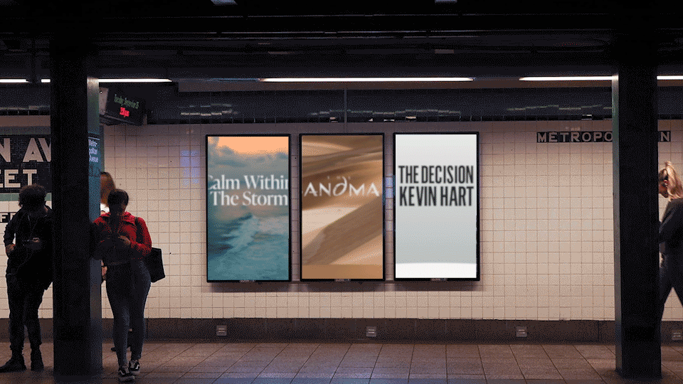
The previous book covers were extremely busy. And, the yellow Only From Audible ‘strap’ was taking up far too much real estate. The new design system created hierachy and used the CHEVRON icon from the logo to create a consistent anchor on the bottom of all layouts.

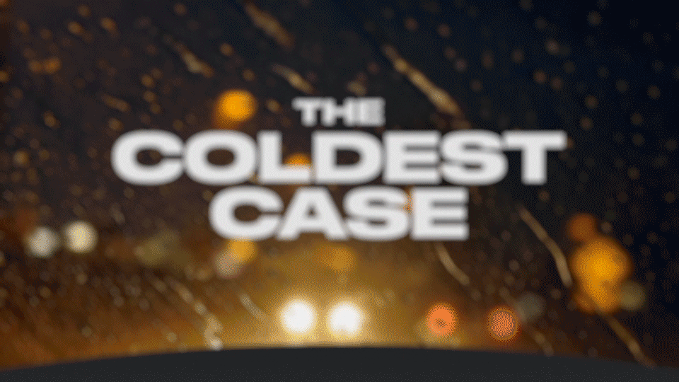
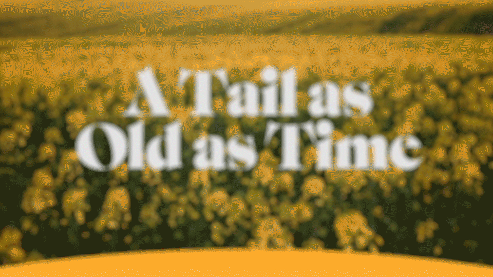
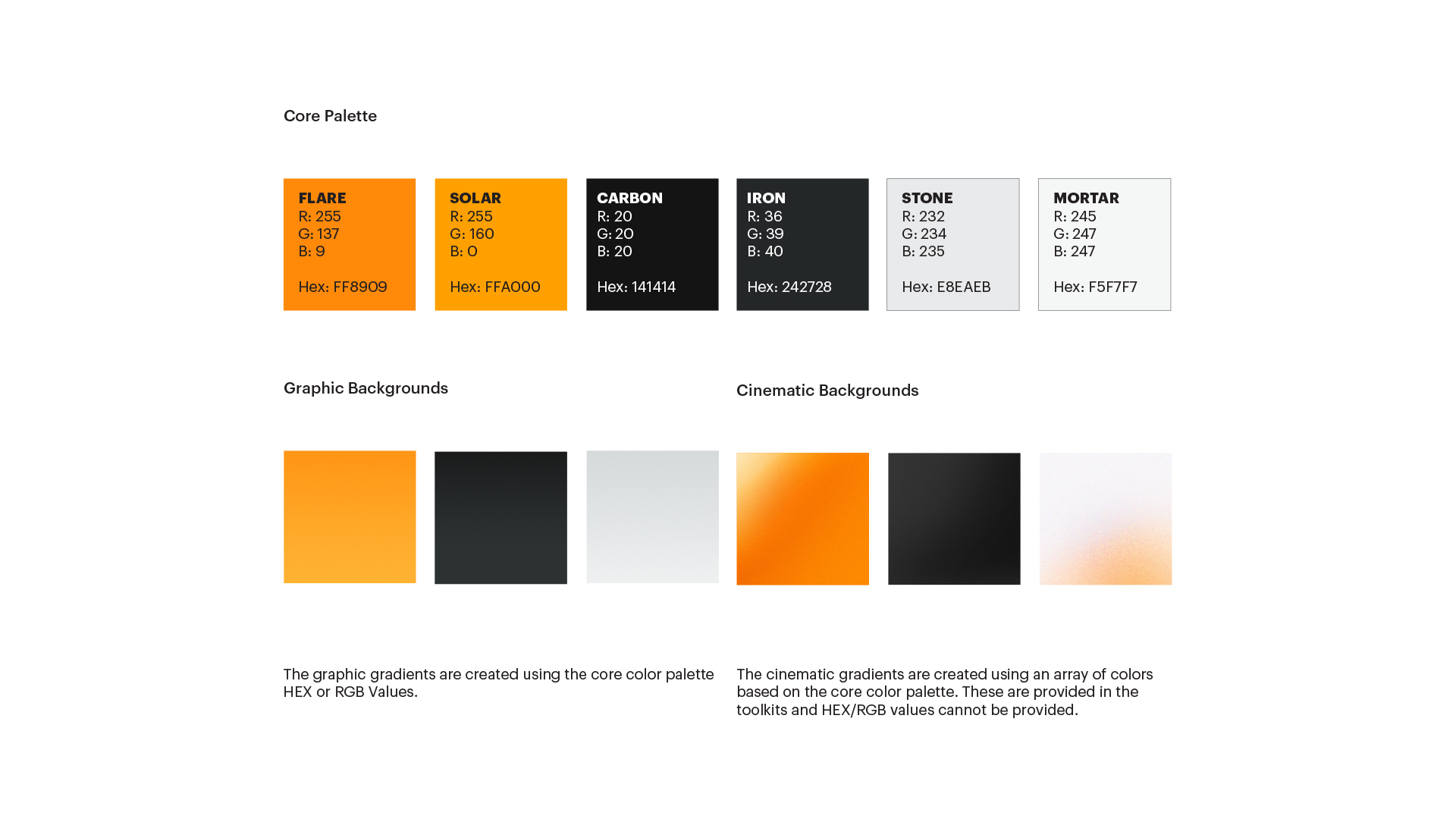
The new design system set up a consistent brand identity but, also allowed for flexibility in color, and the option to also add imagery or footage. The motion language developed also created structure for Audible.


CREATIVE DIRECTION, CONCEPT + DESIGN : Alexis Ames
Sibling/Rivalry : Rosie Garschina
PRODUCER : Kathy Kelehan
ANIMATION : Cyp Sadlon
Audible VP & Creative Director : Josh Pelzek
Created at Sibling Rivalry
Alexis Ames ___ ©2026___ Portland, OR ︎