![]()
CTC - RUSSIAN NETWORK REBRAND


CTC Rebrand
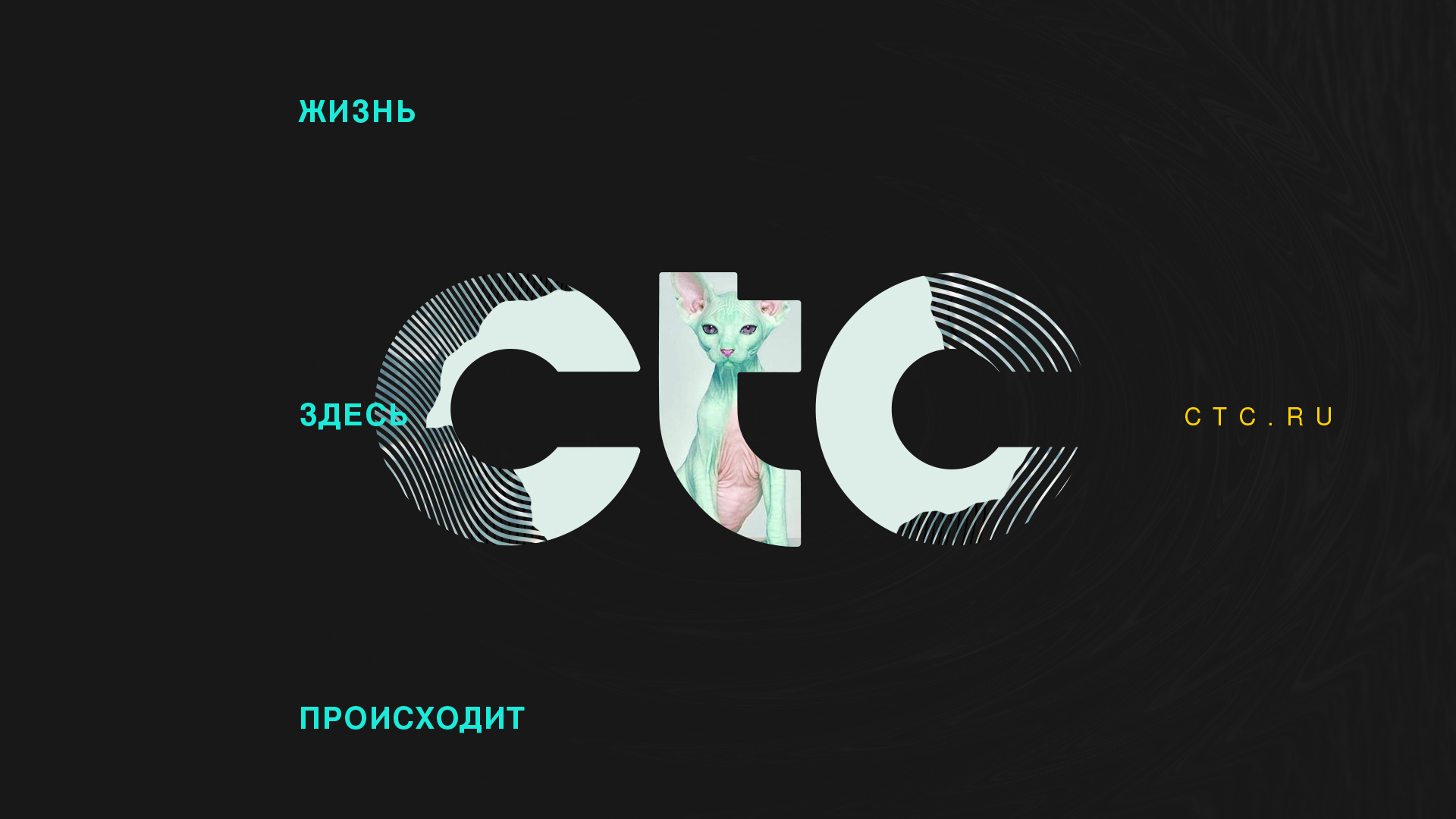
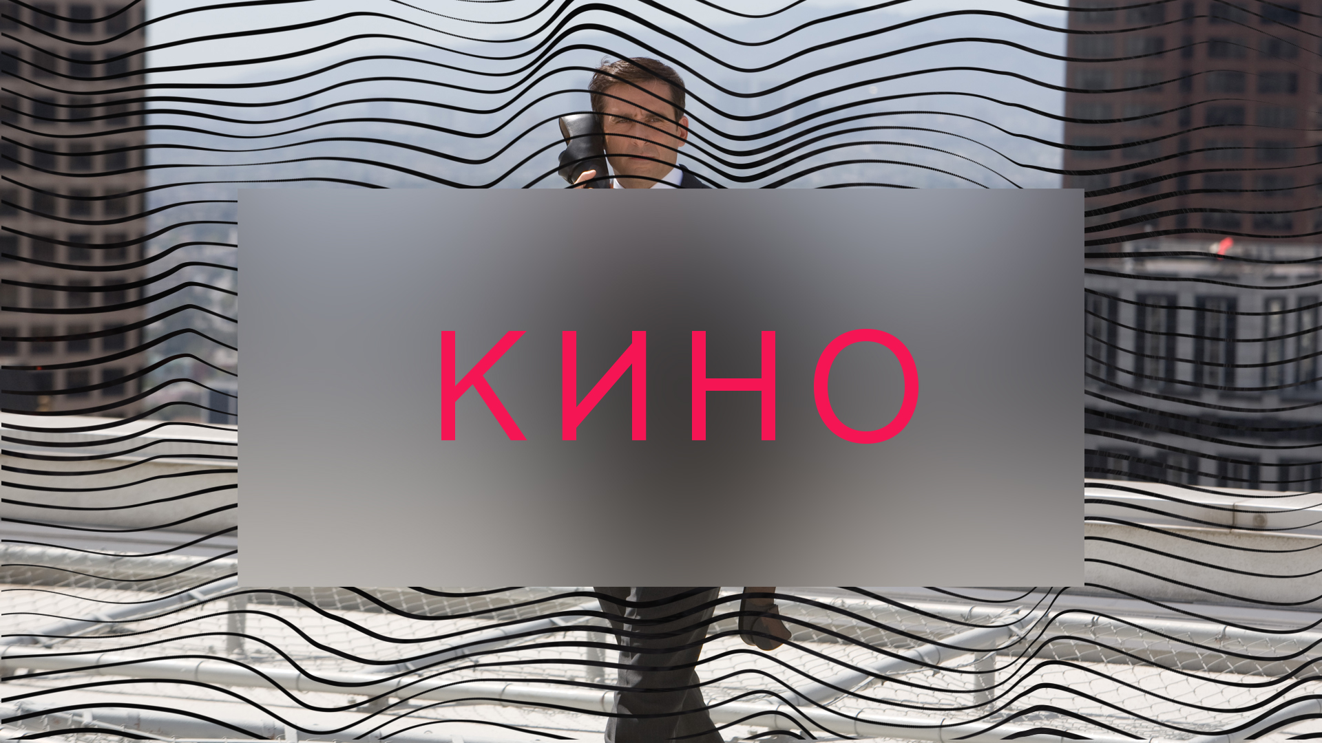
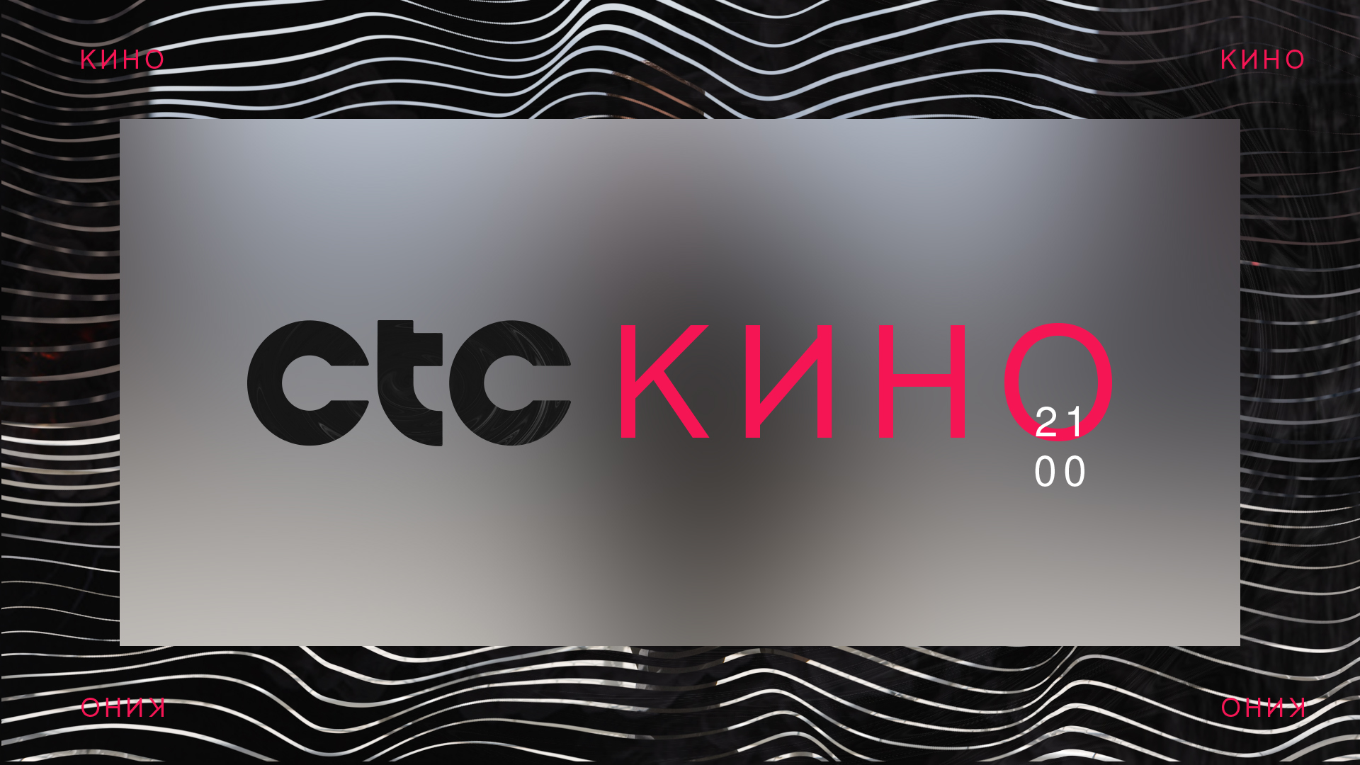
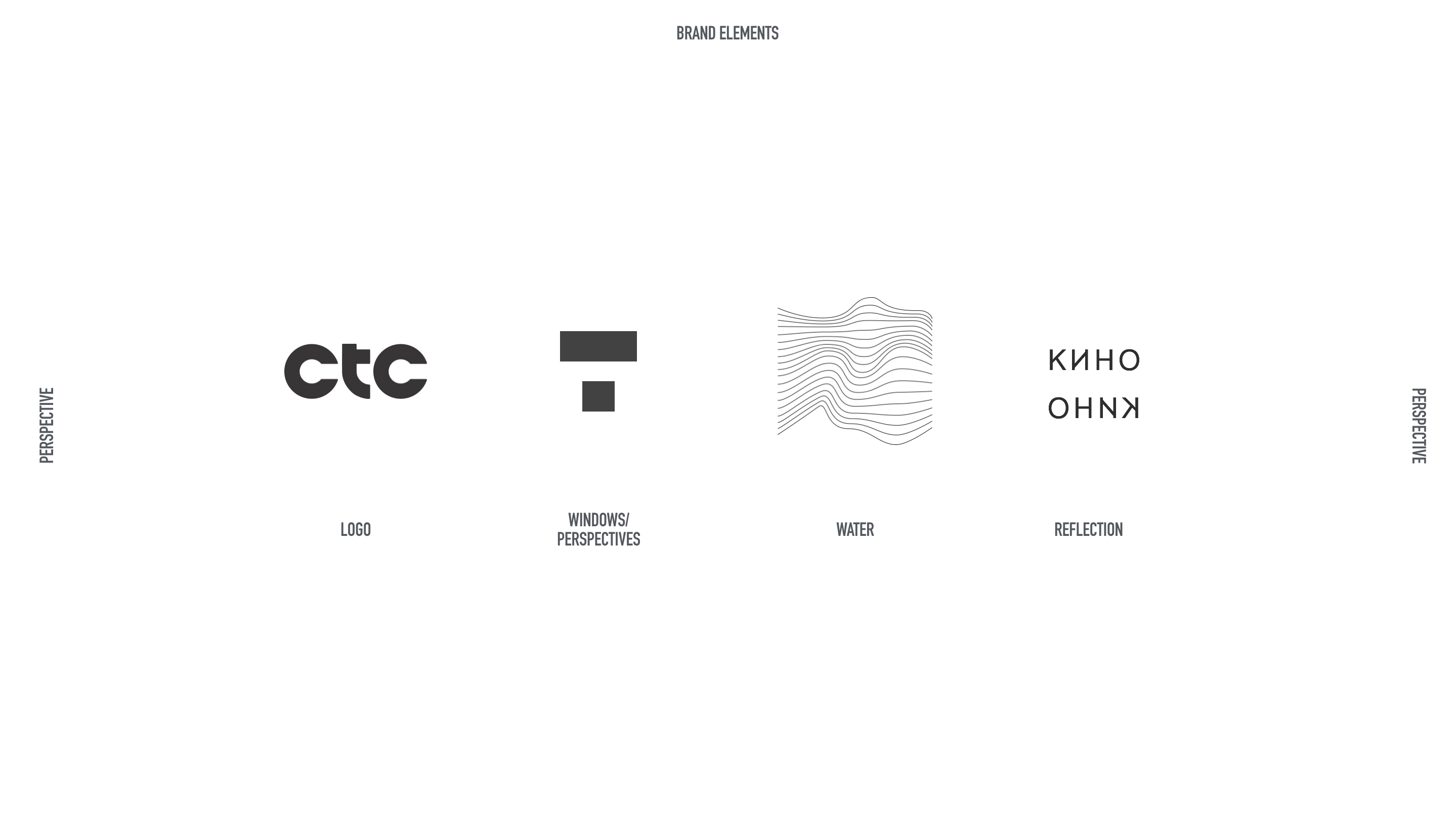
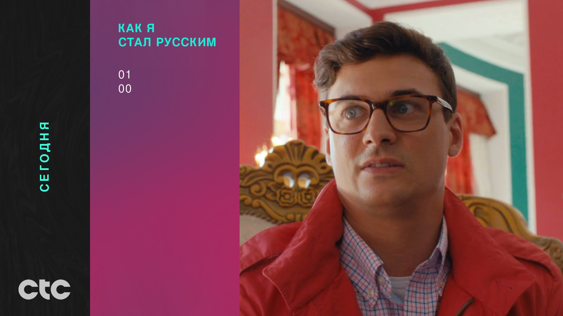
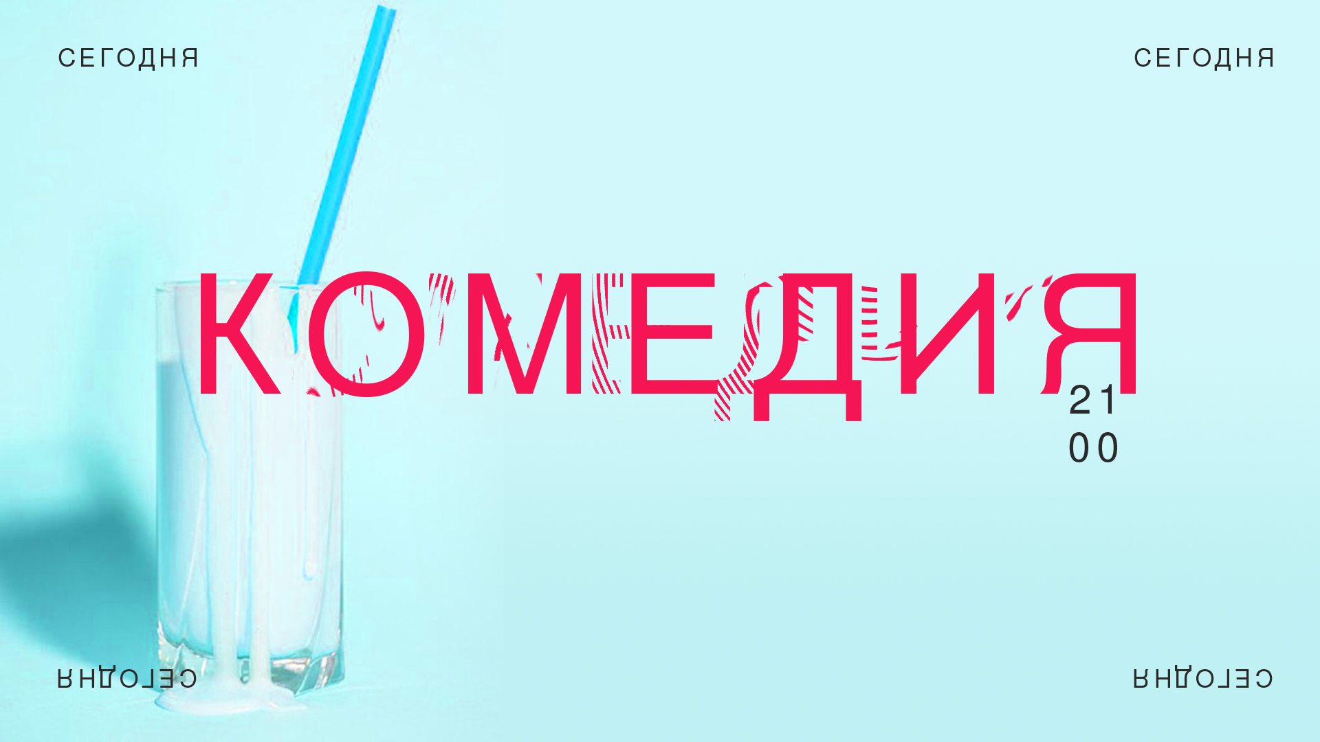
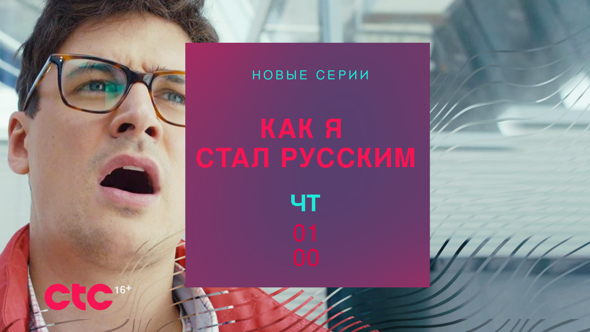
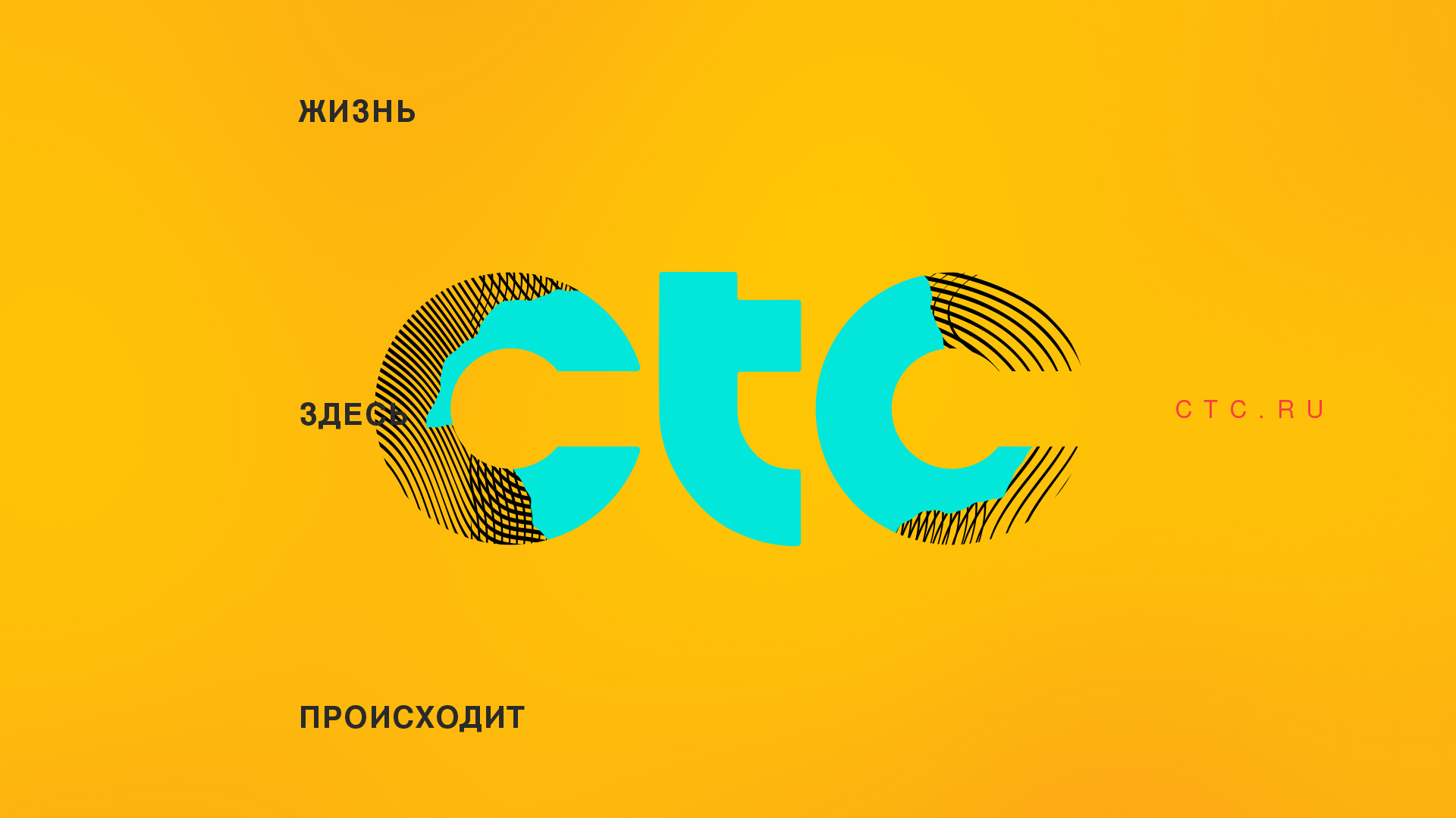
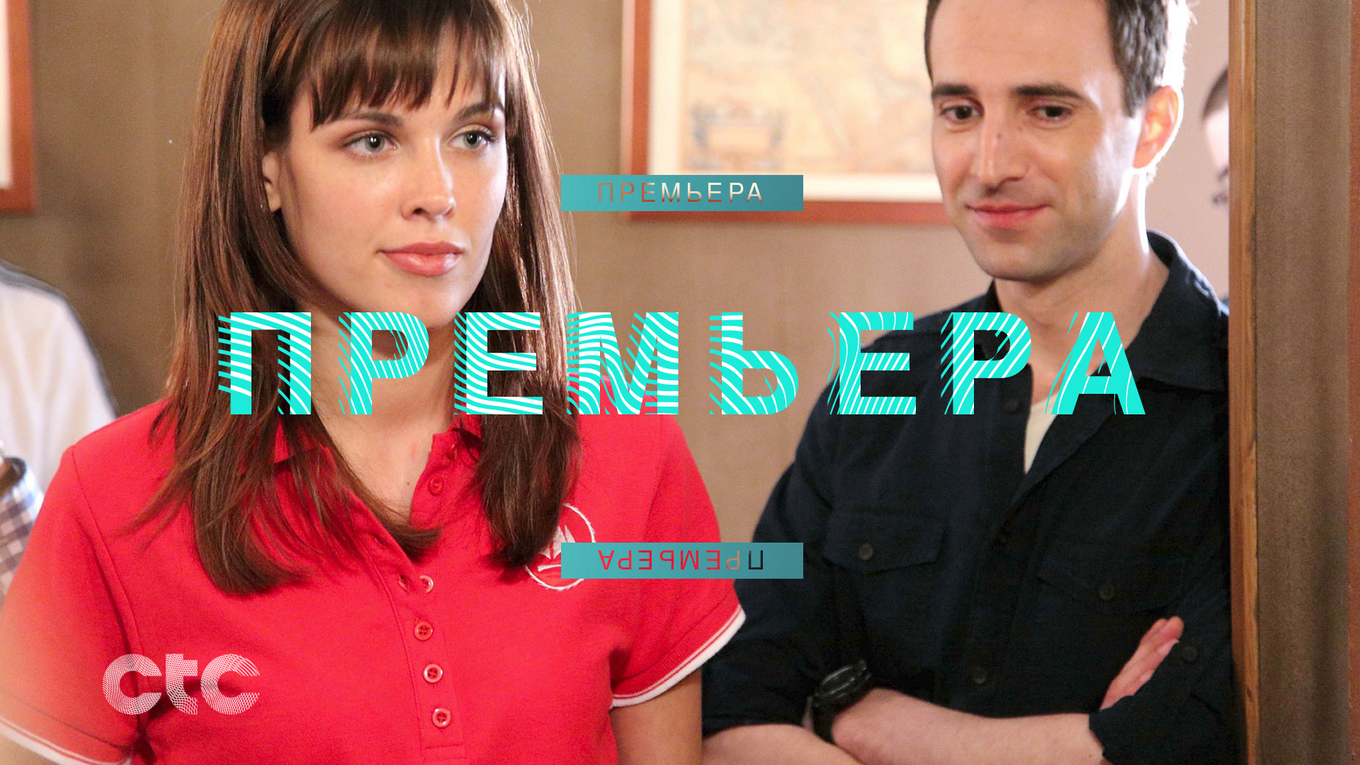
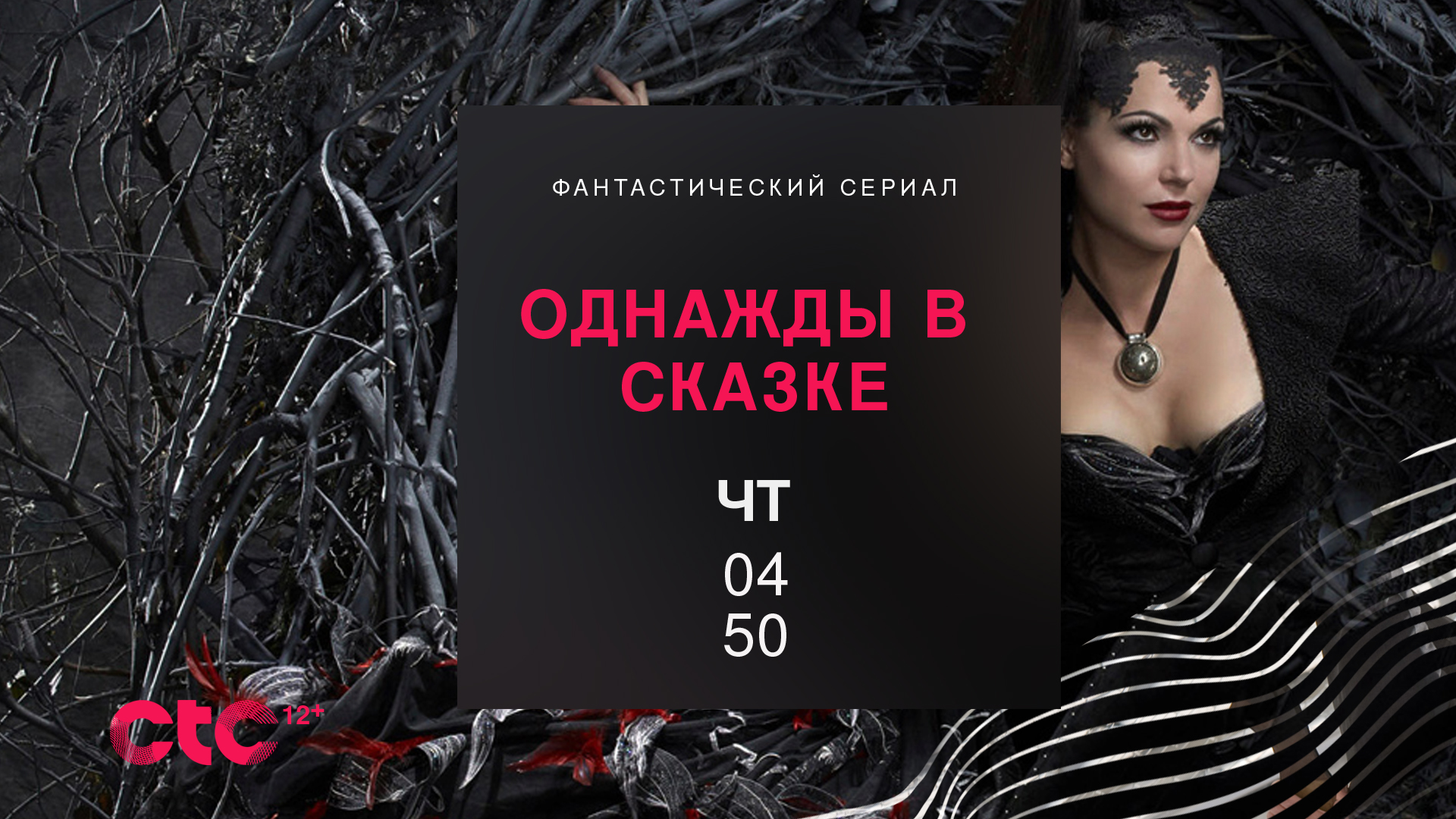
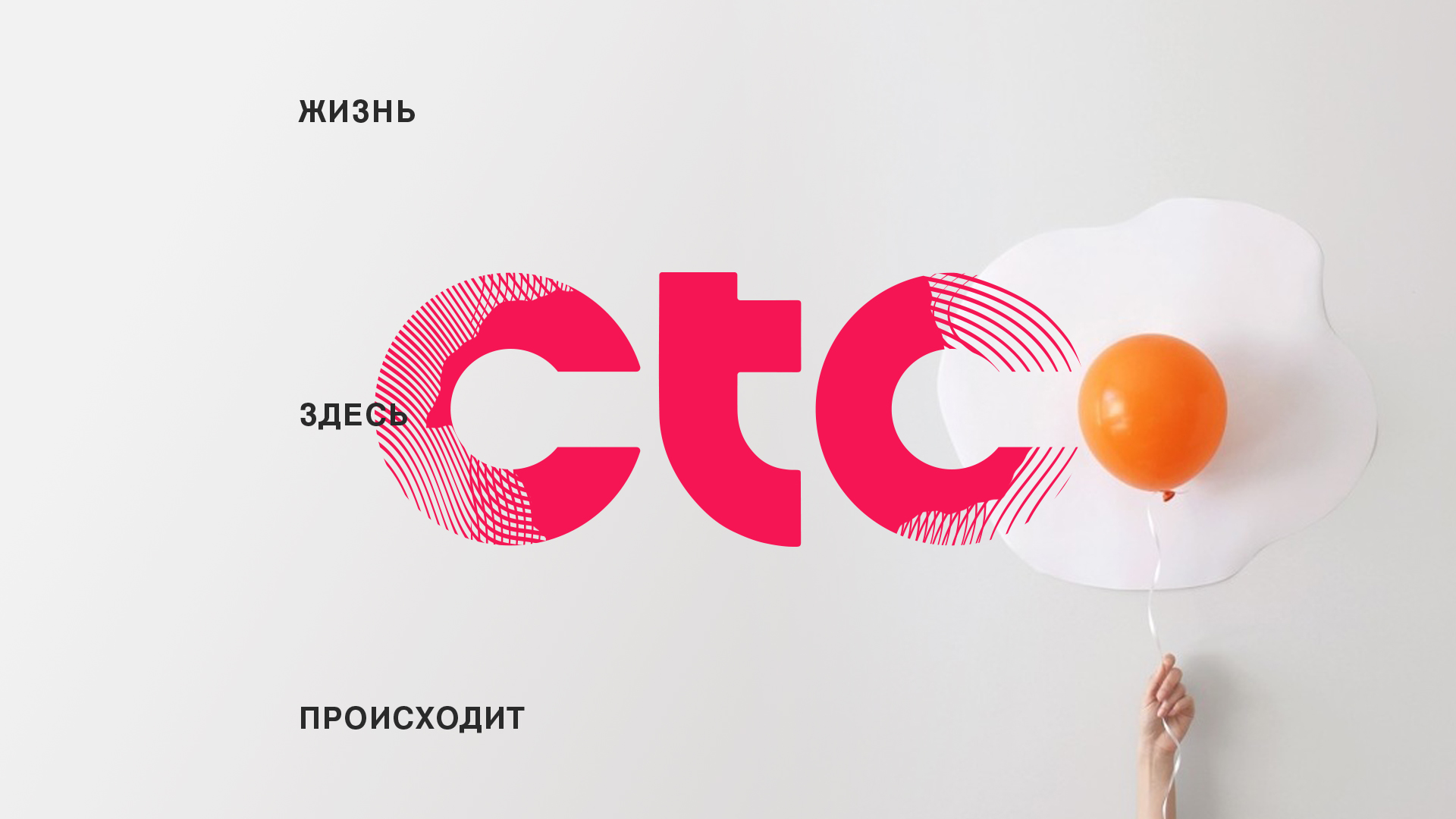
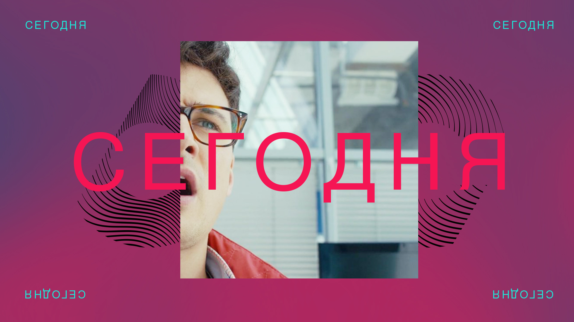
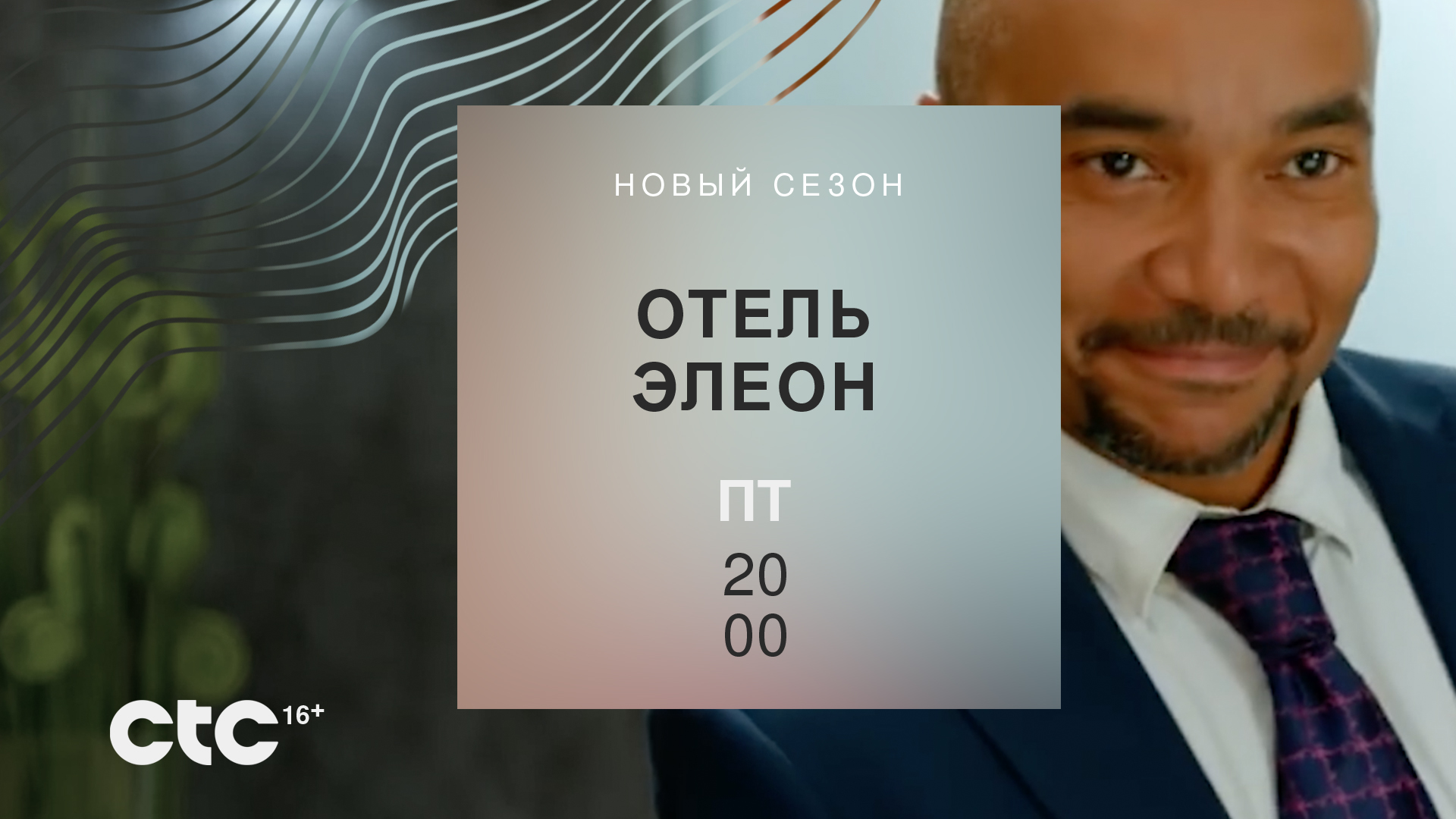
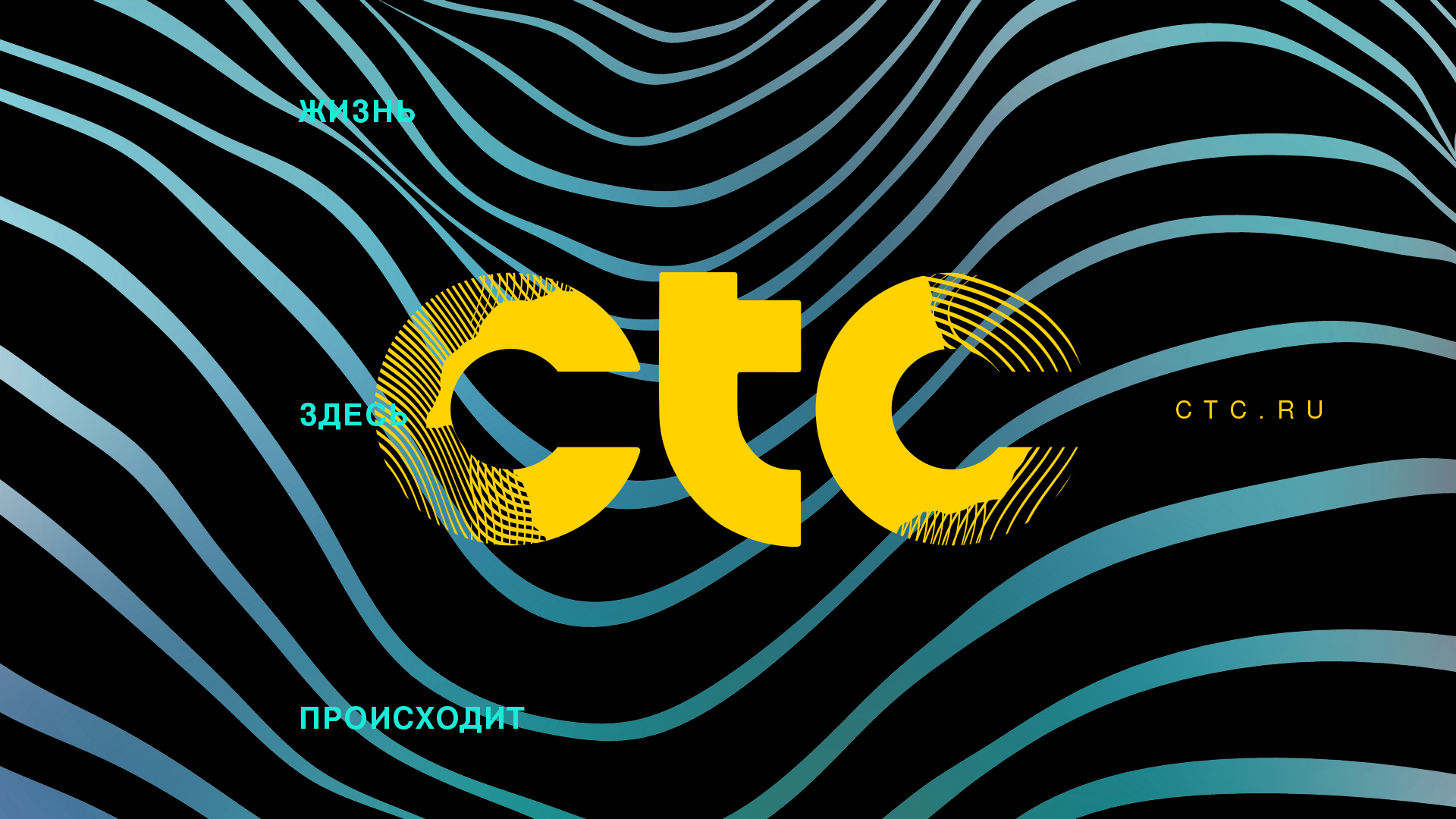
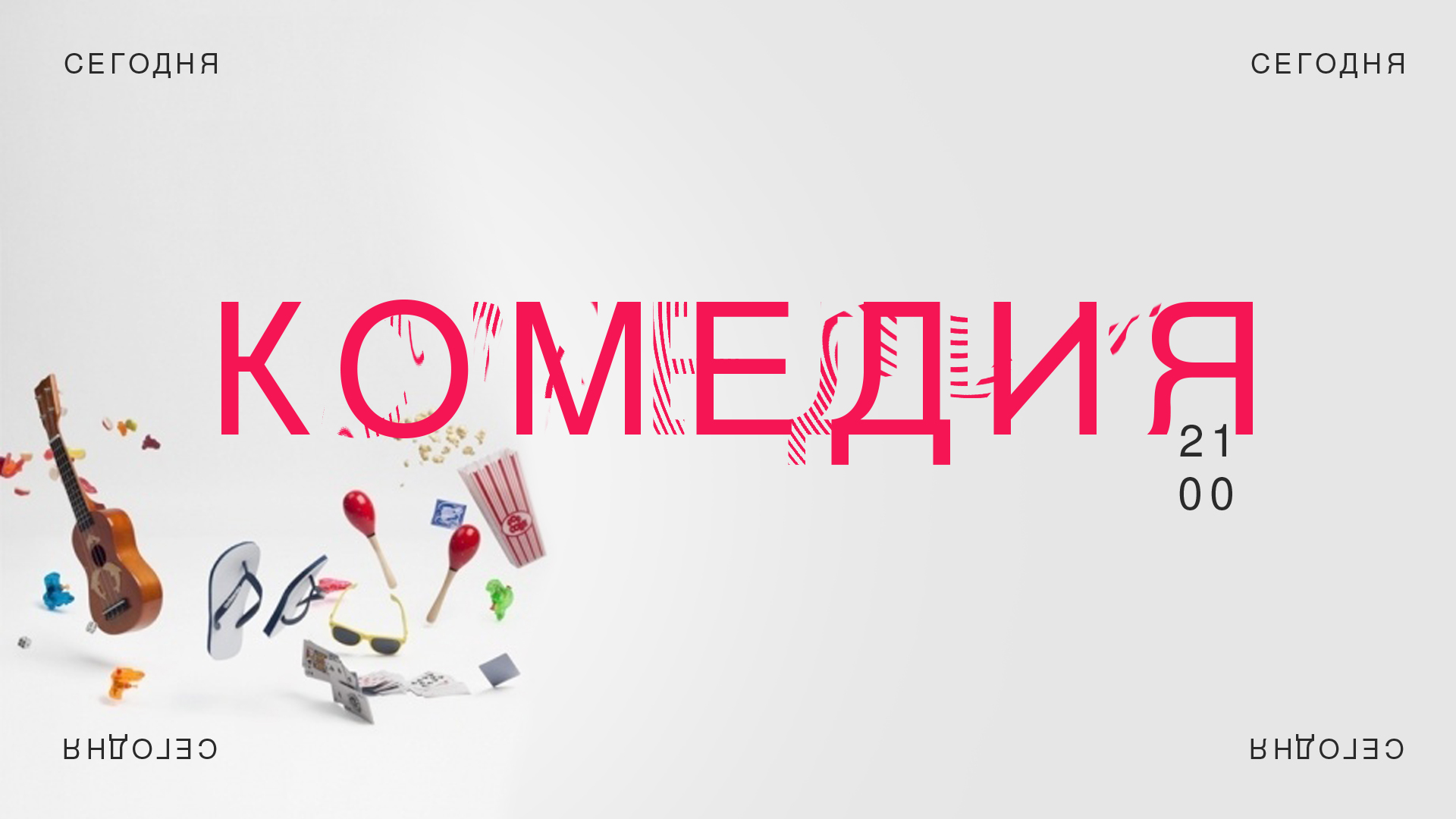
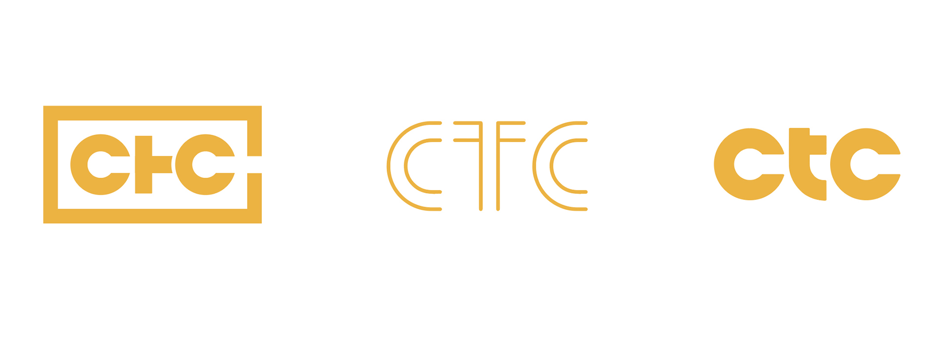
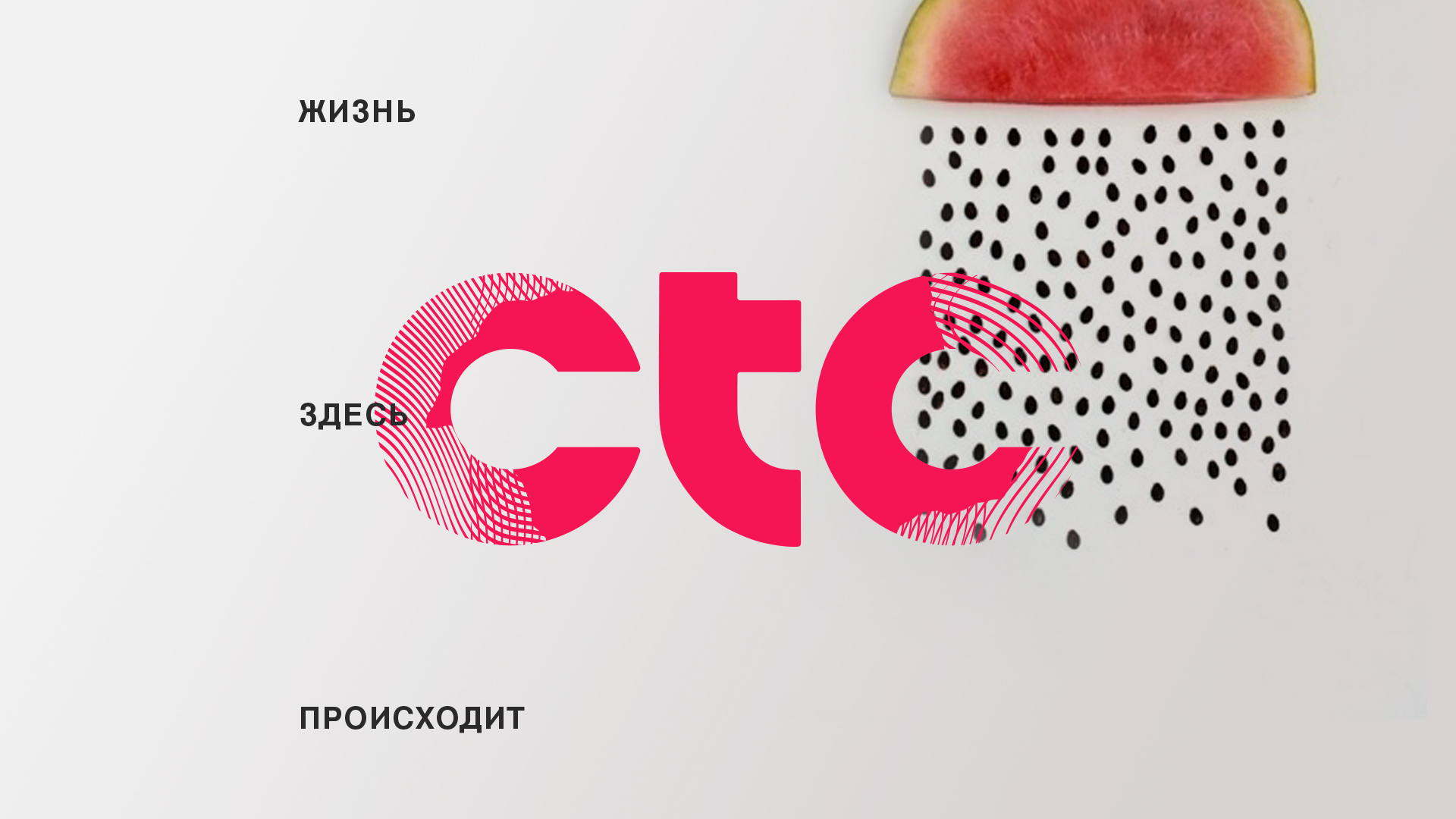
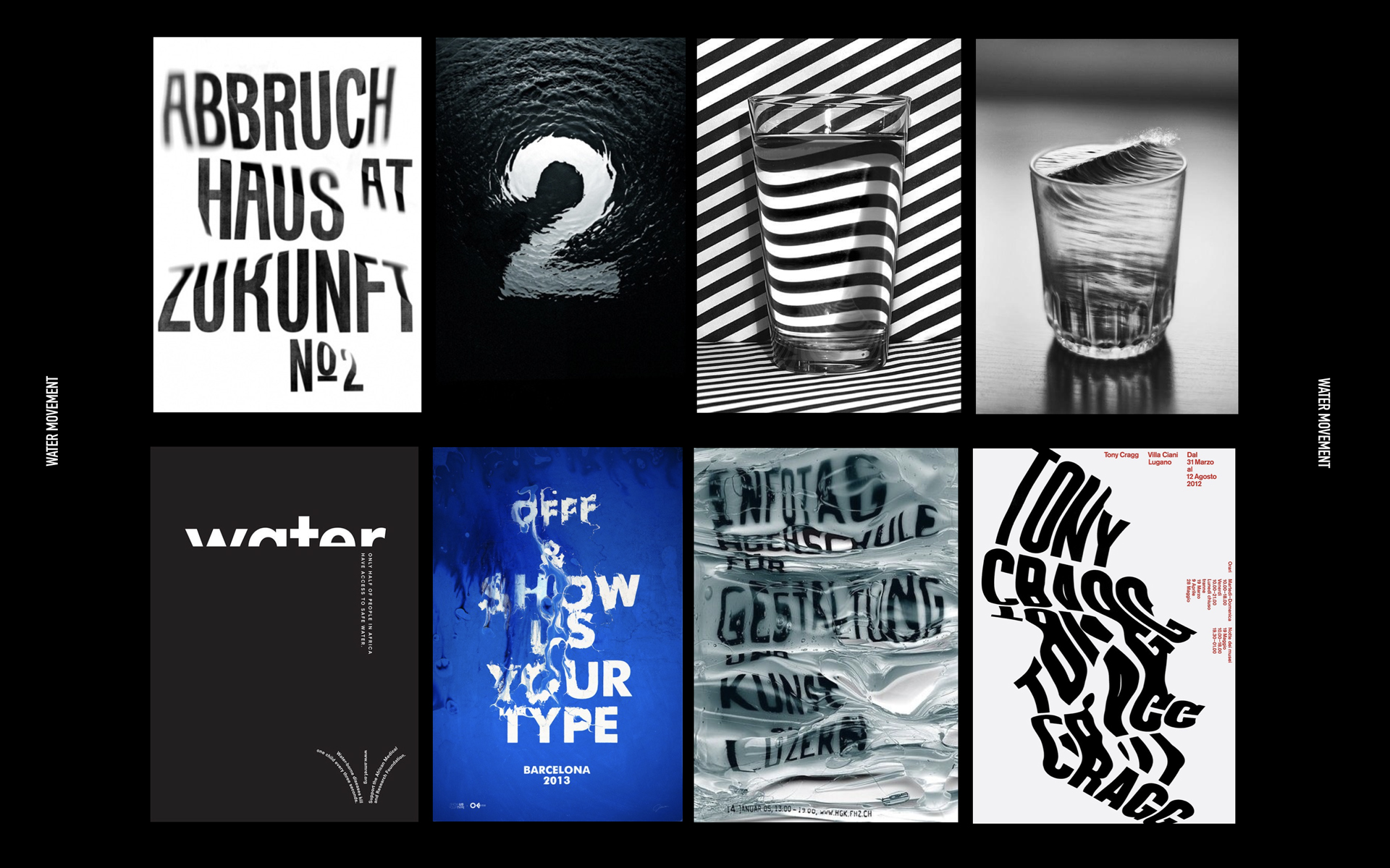
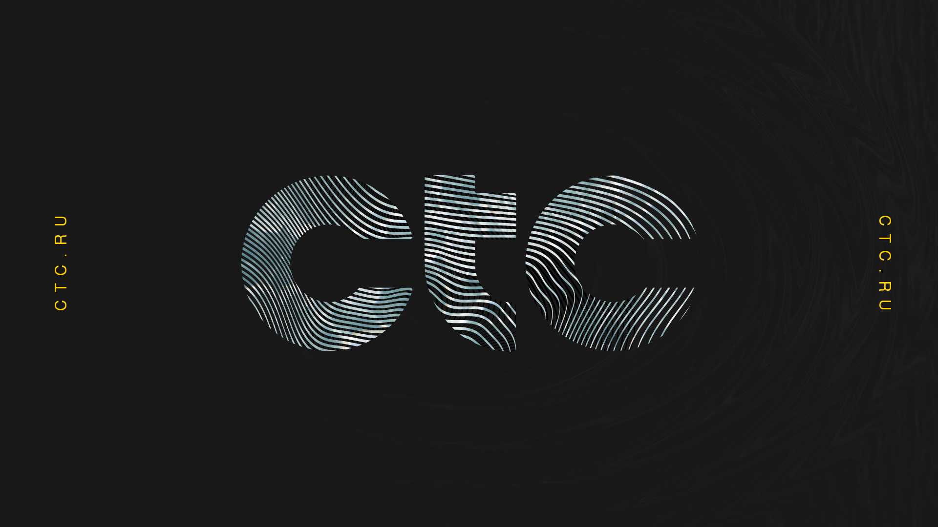
CTC is a Russian Network. In 2017 they were looking to rebrand the entire entity of the network - including the logo. The following is the logo mark I designed along with a developed system for their on-air prescence. The client specifically asked that a direction or concept be based on water. The frame to the right shows the breakdown of this system. To make the use of water feel unique, I created waved vector patterns and type that reflected itself to visually portray the concept of water.
In the end, updated sheduling and timing didn’t allow for us to continue on the project past the initial pitch, but it was a fun to develop and to learn which typefaces actualy have Cyrillic characters.


COO + PRINCIPAL : Scott Matz
CREATIVE DIRECTION, CONCEPT + DESIGN : Alexis Ames
PRODUCER : Javier Gonzales
Created at Thornberg and Forester

Alexis Ames ___ ©2024___ Portland, OR ︎